Coppola is a creative studio based in Athens, Greece, focusing on branding, packaging design and design for social causes.
Our work usually features rational design, solid colors, geometry, subtleness, clean typography and thin lines — plus a light-hearted freehand touch where applicable.
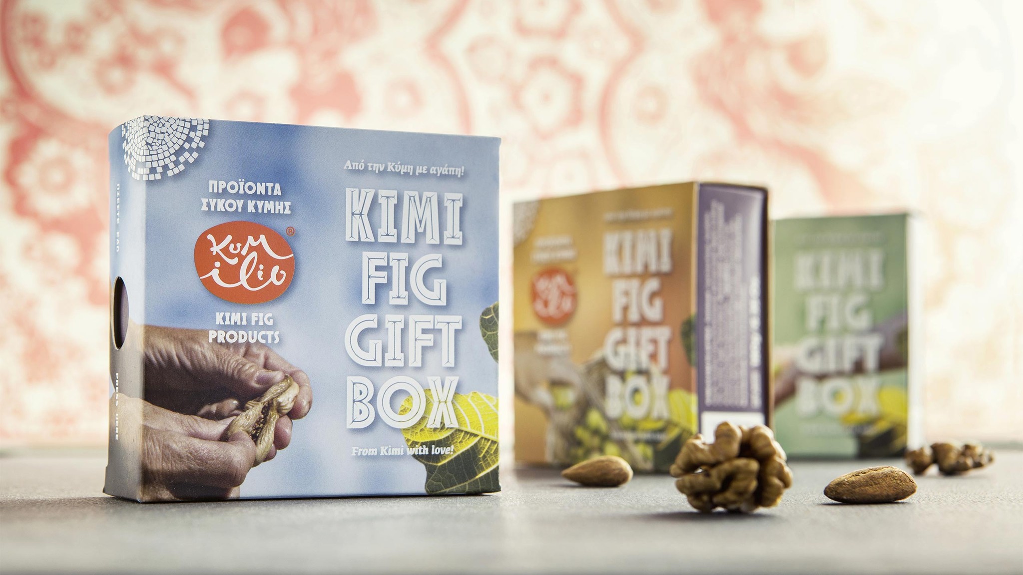
Kumilio packaging
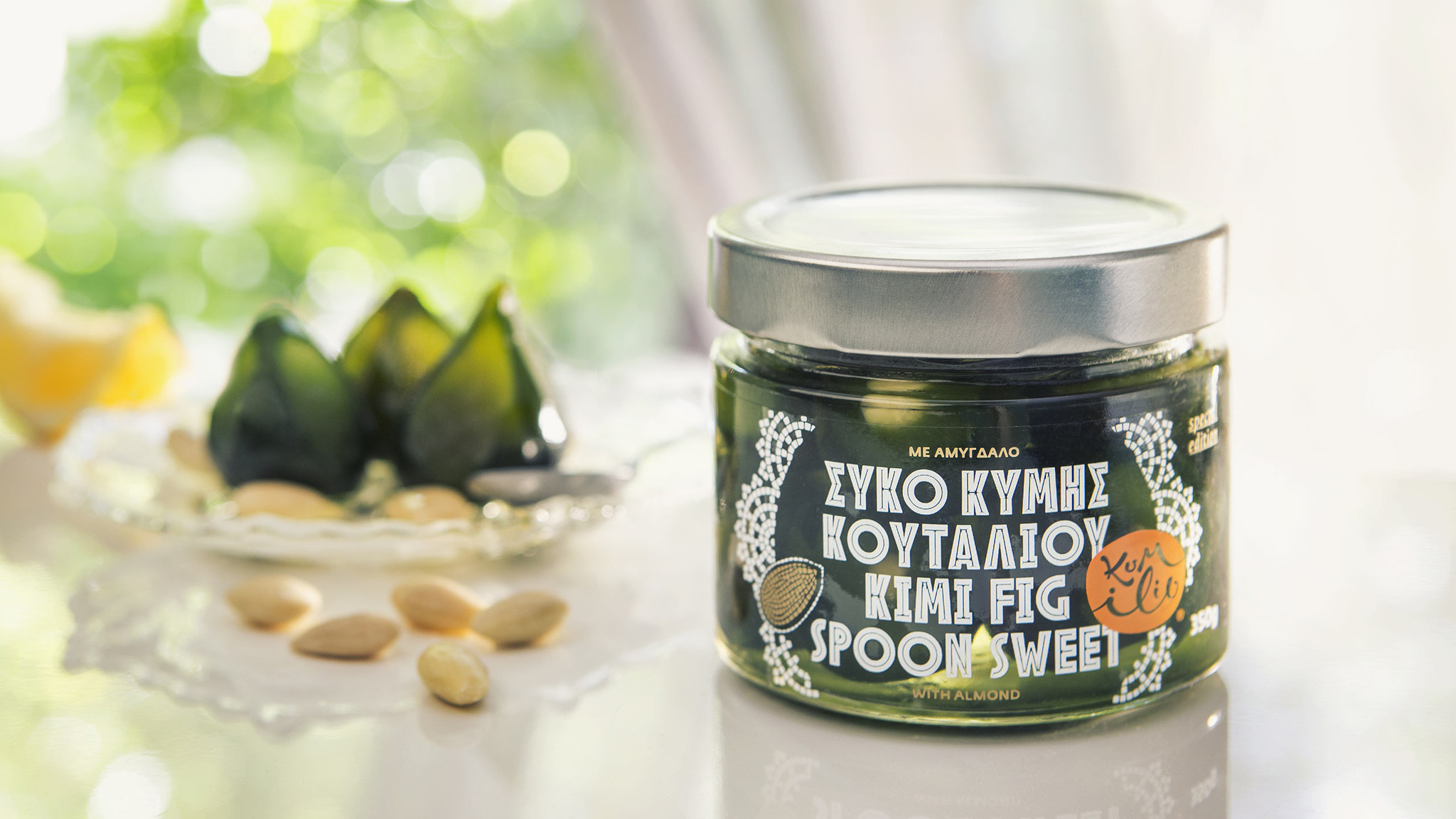
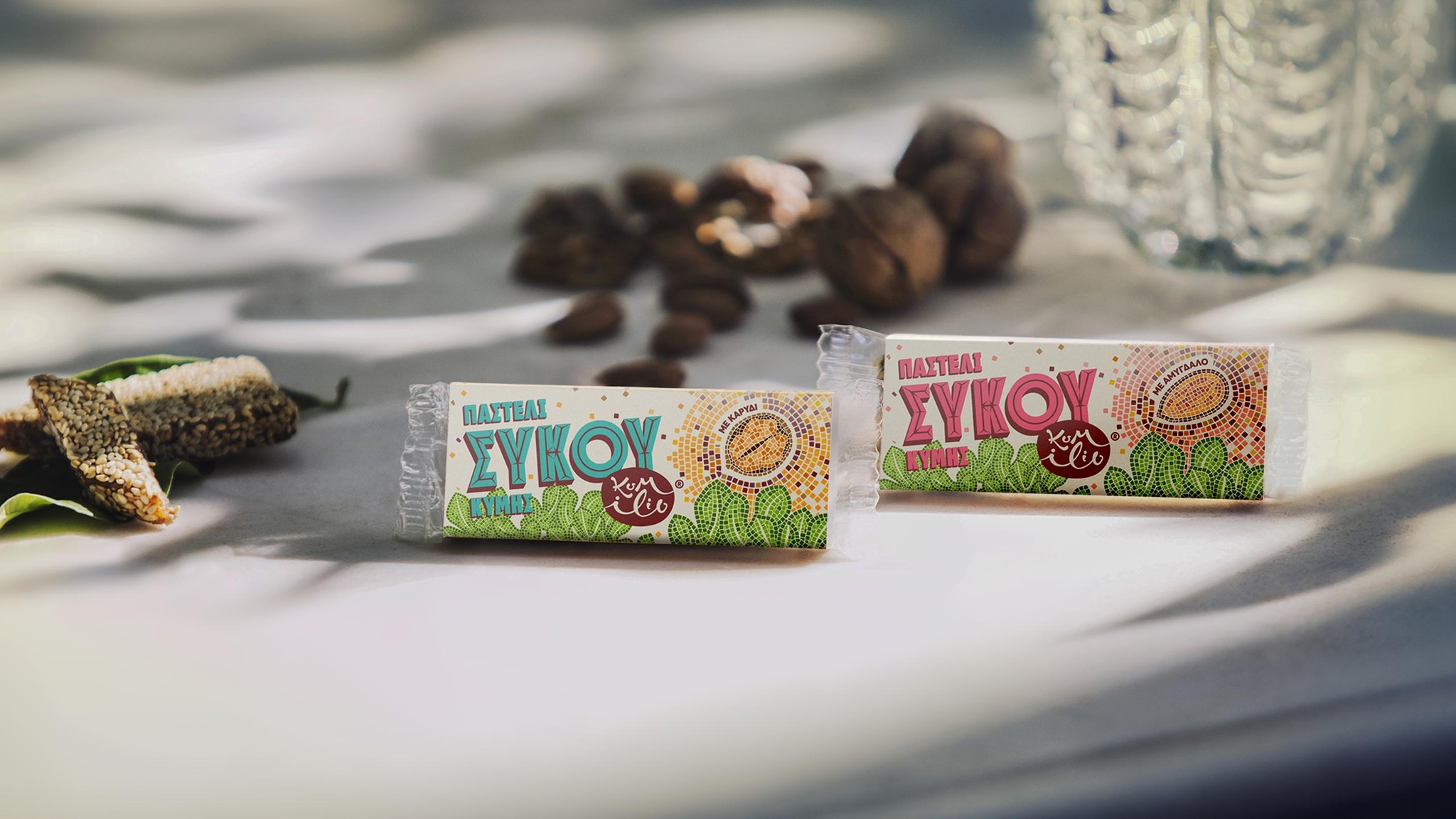
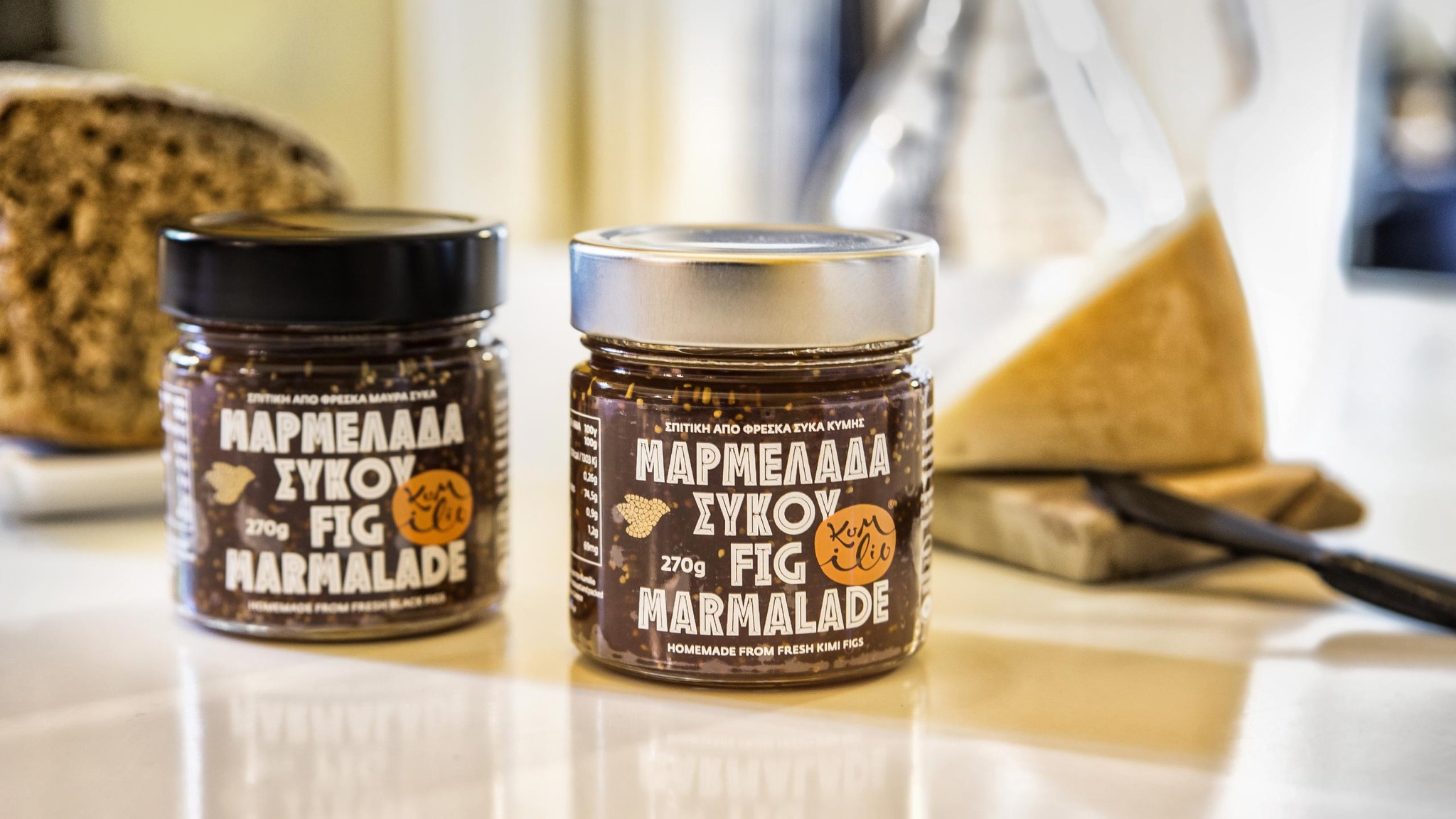
Naming, logo design, branding and packaging for Kumílio, a greek company producing Kimi figs, established in 2015. Except for Kími figs, the company offers a series of products all having the Kími fig as their main ingredient: fig marmalades, fig bars and fig syrup. The brief asked for a modern identity that would subtly connect with tradition and emphasize on the special characteristics of the Kími fig: thin skin, crunchy texture (due to the numerous seeds) and significant energy value.

For the flagship product of the family, mosaic-styled illustrations were created, serving as a subtle metaphor for the figs as they are put together on drying racks before they are let sun dry. The illustrations suited perfectly with the fig bars as well, since - additionaly to the above - the mosaic resembles the fig bar itself, mottled by sesame seeds, dry nuts’ chunks and spices.
“Kumílio” as a brand name is actually a pun made from the words “kimílio” [meaning “heirloom” in greek] and Kúmi, as the locals call their hometown, Kími. A heirloom is an object (eg. family stamper, piece of jewelry etc.) that has been passed down for generations through family members. It usually bears an inscription of one’s initials or full name. The Kími fig was seen as the precious heirloom for the people of Kími.
A calligraphic approach was considered appropriate for the logo, in order to emphasize the uniqueness of such an item, whereas an uncertain but friendly organic shape gives off a natural tone.